Parrish View Farms is a charming, family-run farm that has grown into a scenic agritourism destination and versatile event venue in Southside Virginia. From refreshing their logo to designing event materials, I collaborated with them to create lasting visuals that continue to shape their brand today.
PARRISH VIEW FARMS
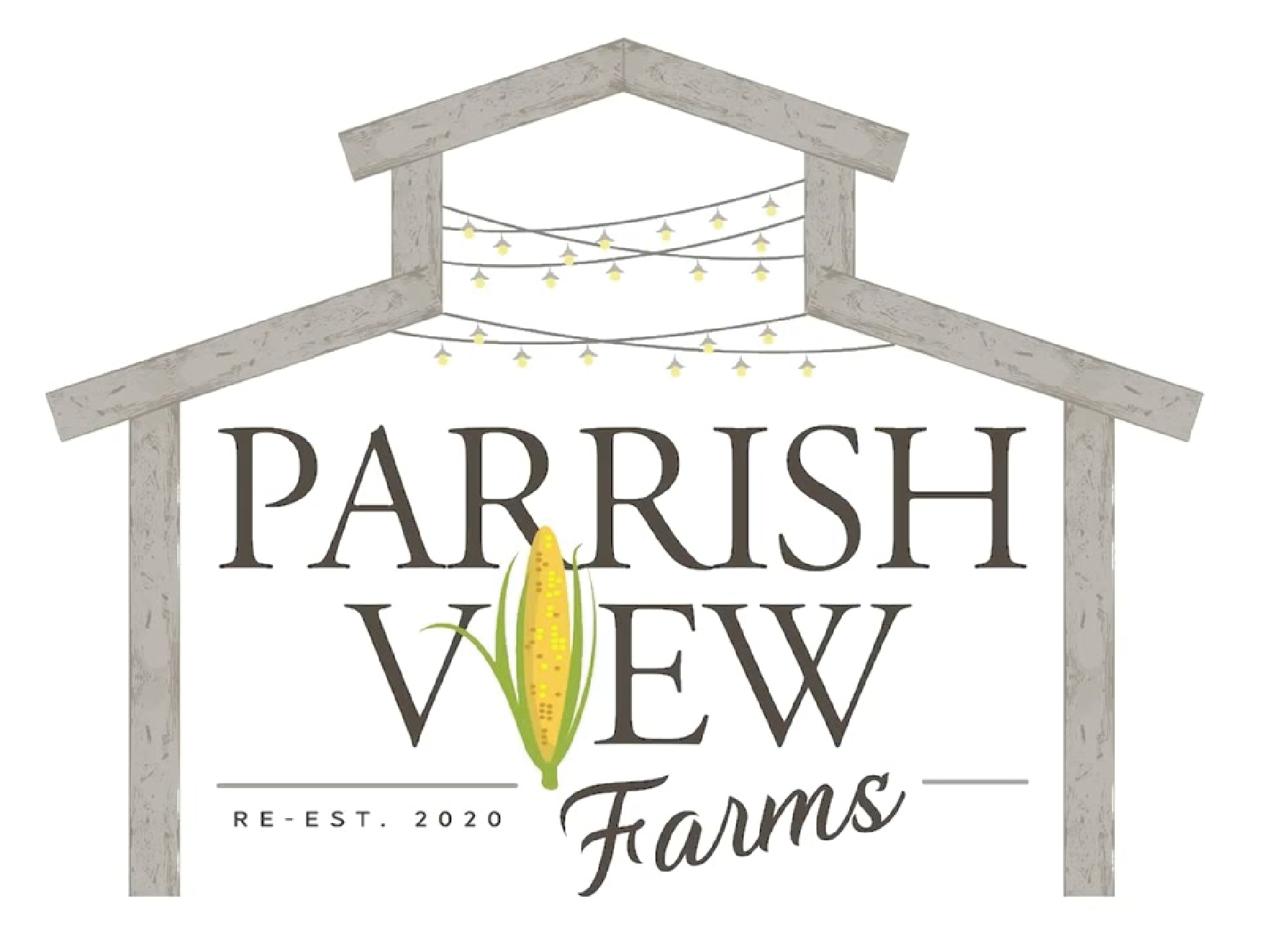
FARM LOGO REBRAND
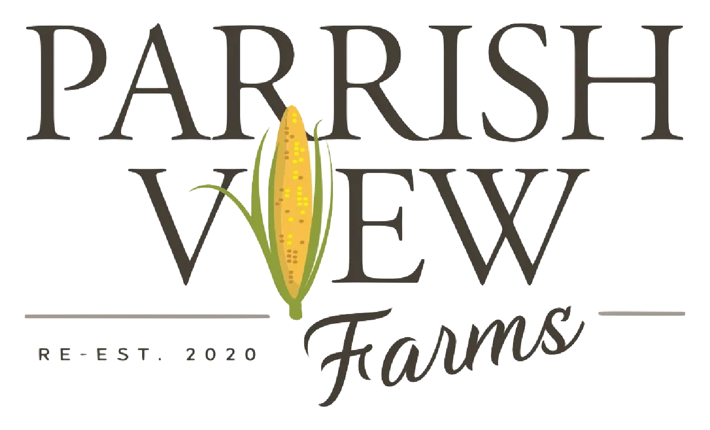
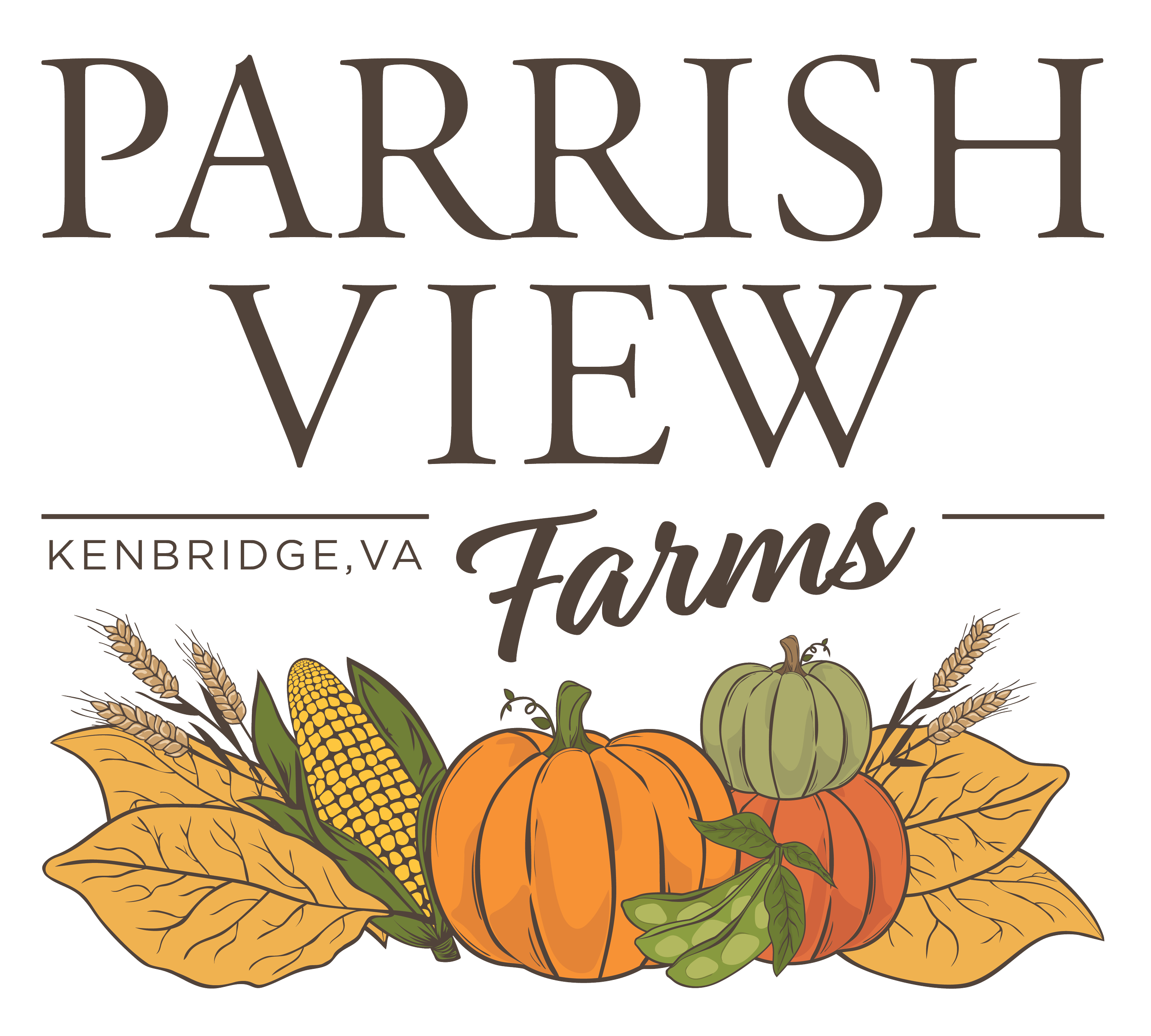
THE TASK
Create a updated logo integrating all crops planted throughout the season.
Update script font and location.
Integrate the crops in a way that feels more organic with the text and can be taken away for a type only logo option.
THE SOLUTION
I drew inspiration from the previous logo’s graphic style, expanding the details with brown outlines that tied each crop together for a more cohesive look.
To enhance dimension, I incorporated shadows and highlights, bringing added depth and refinement.
For versatility, I designed the graphics to layer seamlessly within the text using symmetry, allowing the logo to stand strong with or without the crop elements.
THE OUTCOME
The final logo was well-received by the client, effectively capturing their vision while offering flexibility for multiple applications.
EVENT LOGO REBRAND
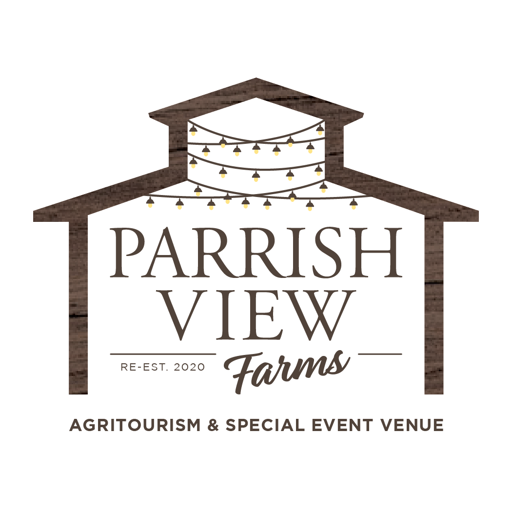
THE TASK
Keep the integrity of the layout and add updated logo without corn.
Mimic the event space with brown wood.
Add extra tagline at the bottom of logo
THE SOLUTION
I refined the outline of their event barn with added detail to enhance visual recognition.
To further strengthen brand awareness, I applied their signature wooden texture as a clipping mask within the barn graphic, creating a cohesive and distinctive look.
THE OUTCOME
The final logo successfully aligned with the client’s vision while strengthening their overall brand identity, resulting in a design they were highly satisfied with.
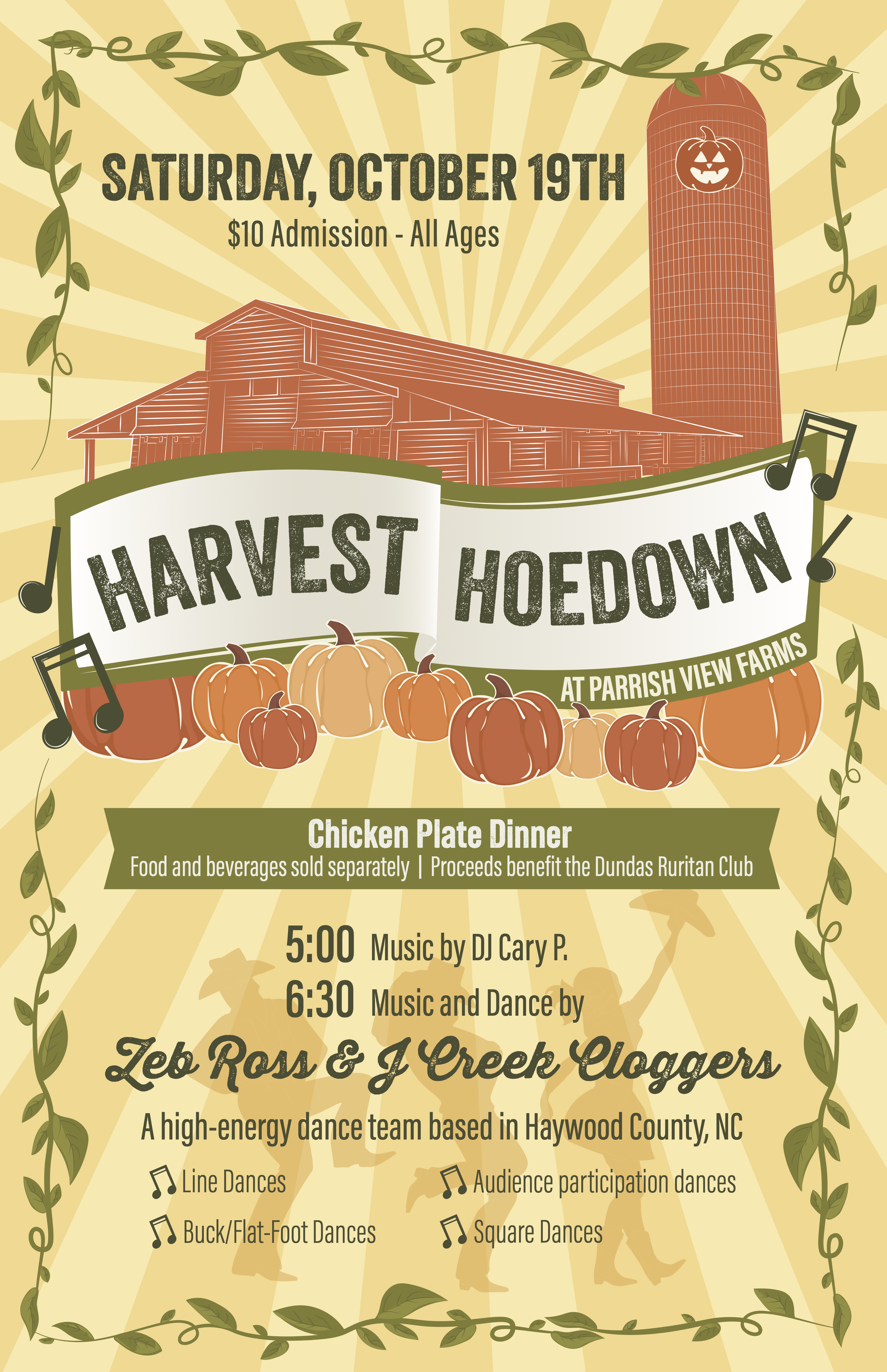
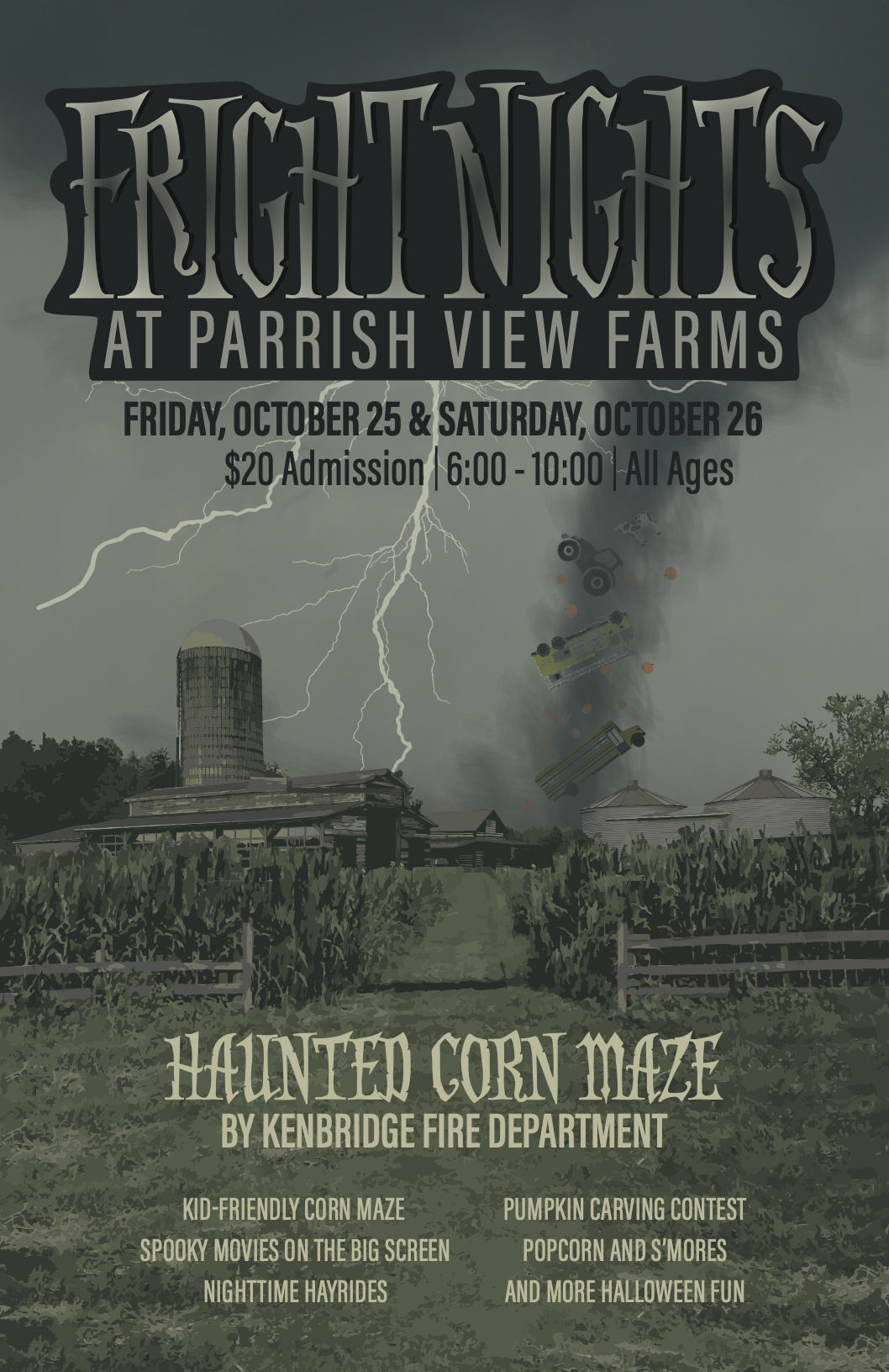
EVENT POSTERS